Want to color-along and do this stunning color-fade background?
You can apply this technique to any coloring page, even if you don’t have the Coloring Book of Shadows!
Supplies:
These are the supplies I used, but of course, you can use whatever brand of pencils and whatever coloring book you have.
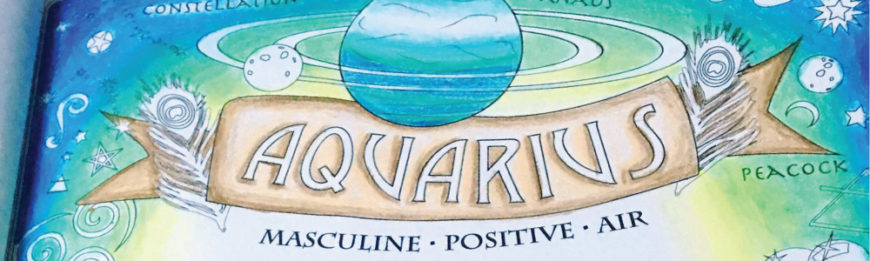
From: Coloring Book of Shadows
By: Me! Amy Cesari.
Pencils Used: Prismacolor Premier 72 Pc. Set
Colored Pencils Used for the Background:
Copenhagen Blue
True Blue
Parrot Green
True Green
Yellow Chartreuse
Cream
Colored Pencils Used for the Banner:
Beige
Light Umber
Colored Pencils Used for Amethyst:
Dark Purple
Parma Violet
Lilac
70% Warm Grey
Colored Pencils Used for the Blue Orb:
Violet Blue
Aquamarine
Light Aqua
Cloud Blue
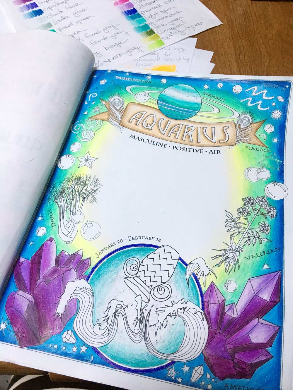
Step 1: The Background!
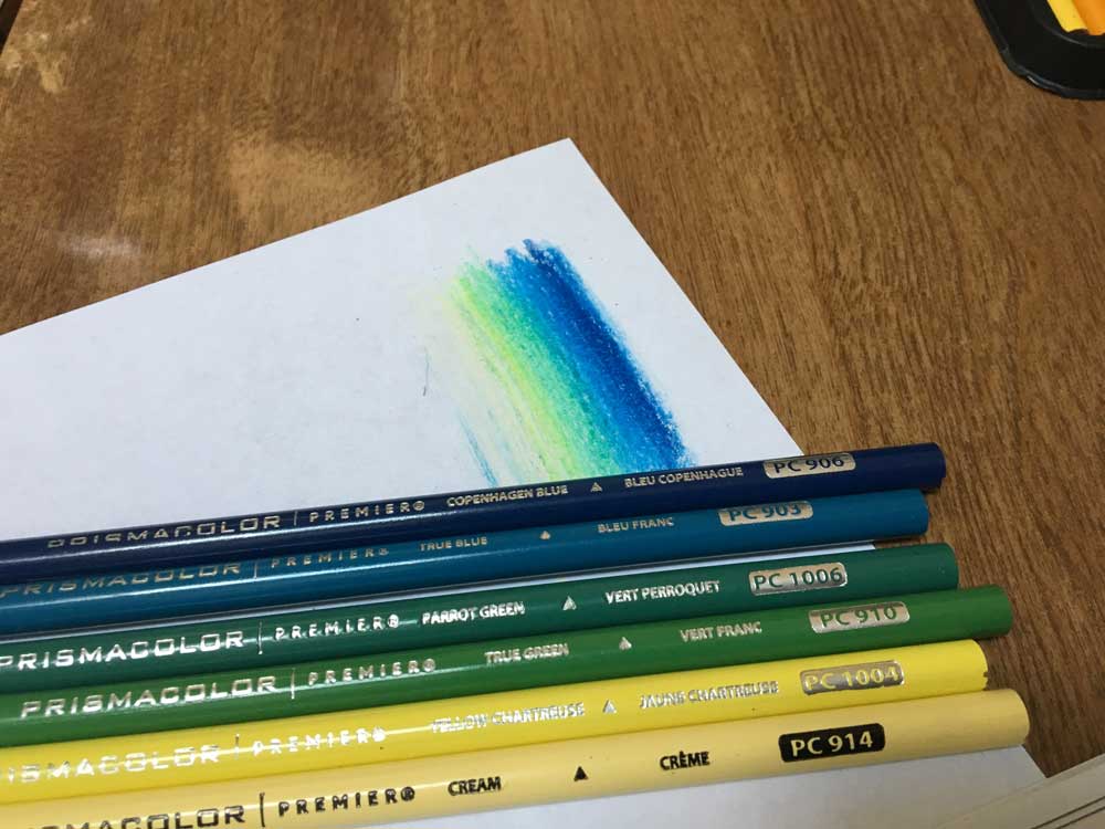
First, test the colors you want to use.
I made sure what I was thinking blended nicely before I did the whole page, so I tested them quickly. And they looked awesome! I was going for kind of a “dawning of the Age of Aquarius” look, so bright in the middle, going out to dark on the edges.
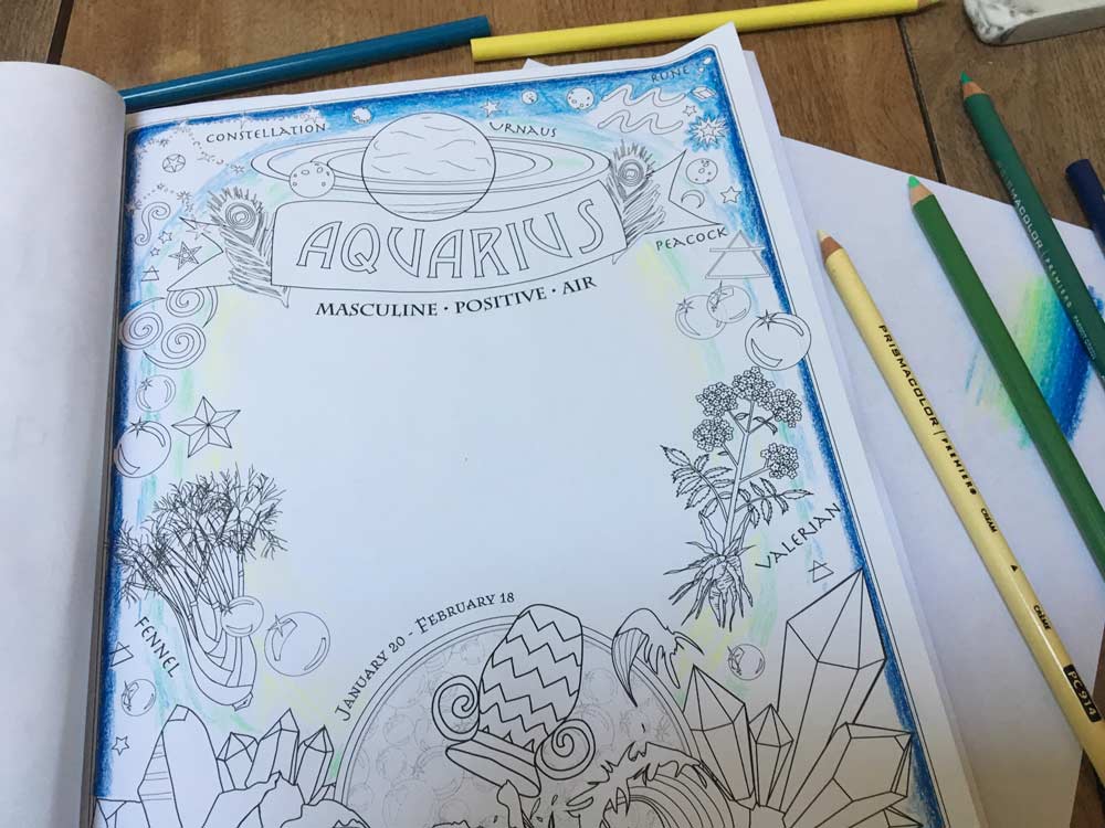
Then, block out the colors for reference.
- It’ll fade from dark on the outside edges to light on the inside.
- Outline the very darkest outside edge in Copenhagen Blue (or whatever dark color you’re using).
- In a super-rough manner, block out the True Blue, True Green, and Yellow Chartreuse.
- This is to give you a rough guide or sense of what to aim for when you shade it in.
- See above how I don’t have it perfectly filled in or blended at all, but my eye can now see a basic guide of where to blend to green and yellow before I go farther on the blue. This’ll help keep the color fade looking even.
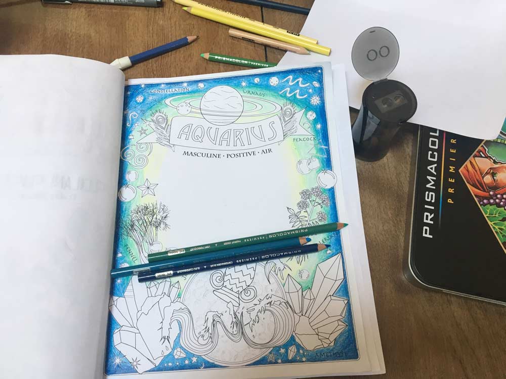
Fill-in the blue-to-green fade.
- Blend the darker Copenhagen Blue to lighter True Blue.
- Then, start blending True Blue into Peacock Green, and Peacock Green into True Green, getting lighter as you get in towards the middle of the page.

Fade out to White
- Blend True Green to Yellow Chartreuse
- Then, Yellow Chartreuse to Cream
- To finish up, blend Cream to White in the middle of the paper.

Pretty awesome, right?
The key is to keep going and keep on blending. If it doesn’t look even or “not quite right” keep going and blend it more.
Step 2: Color the Other Items on the Page
I’m going to walk thru how I colored a few of the main elements on the page — then you’ll be off on your own to finish it up any way you like.
Color The Banner
- Using the Beige pencil, color the whole thing as the base layer. I left the “Aquarius” letters blank white on purpose, but feel free to color them if you see fit.
- With Light Umber, I shadowed only the lower-left sides of the letters to make them pop off the paper. Notice I didn’t go all the way around the letters… just the lower-left to make it look like a shadows.
- Again using Light Umber as a contrasting color, darken the edges of the entire banner and fade it into the beige you did before. This will give the whole thing a richer effect.


Color Uranus…
- I did Uranus in the same blue and green shades from the background, keeping defined stripes in the atmosphere, and using the white pencil to get a couple nice highlights at the top.
- You can also see a bit more detain on the simple Aquarius Banner, using just 2 colors to get a nice contrasting look.

Color the Amethyst – Darkest First
Yay the crystals! The part that’s most fun or most intimidating! Ha. But no reason to be inimidated! Just remember to use contrast when you color crystals. You need dark and light parts to make them look realistic and dynamic,
- First, I used Dark Purple and colored the bottom-outside facets. Since the light of the background is coming from the middle, I kept with that and left the inside-top facets white.
- So the crystals on the left have the bottom-left part colored Dark Purple.
- The crystals on the right have the bottom-right part colored Dark Purple.
- Notice how I used lighter pressure to fade it, so one pencil gives a range of dark to light.

Add the Highlights
- Using the lightest purple, Lilac, I colored the opposing facets. Now you can see the basics of the contrast here — still rough but looking pretty good, right?!

Blend and Shade!
- This is your call — you can see even just 2 colored pencils gives a great look, and you can stop there.
- But I’ve added some additional colors: a medium purple, Parma Violet, and 70% Warm Grey to the very bottom-outsides for the darkest shadows.
- Notice I’ve left some spots very light lilac to almost white where the light hits.
The Blue Orb and Beyond…
- Using Aquamarine, Light Aqua, and Cloud Blue colored pencils, I used the same color-fade technique to blend the blue orb from dark-to-white in the middle, just like the background.
And there ya have it!
A gorgeous, glowing, “dawning” background and a couple of bold elements to get you started. Now, finish up the rest to your liking. You’ve got the skills and vision to make it happen!

Sign up for new book announcements and free printable pages!

Get this Moon Magic set now!
... + more magical freebies & infrequent newsletters